
I was particularly struck by the above pictured quilt so decided to use it as inspiration for mine, but didn't want to try and do a straight copy. Although I like the negative space, I wanted to have some more colour than this one. I actually worked out my design the old fashioned way with a piece of graph paper and a pencil, however as I'm writing this post in England and my pieces of paper are in Australia I can't show them to you. I can describe my design process though (hoping I remember it correctly). First I thought about what the above design really is when broken down into squares

But from that I estimated that the squares are smaller than the size I'd like so modified it slightly but still pretty similar

But this is where I decided to start adding in some more colour to the design, so I added in another row of squares


But this option was even worse! It looked like two strips of filmstrip, and that definitely wasn't the look I was going for!! Since I was working on this at a Sit and Sew Day I was lucky enough to get input from others, and my final design was actually entirely due to Sally, who suggested the slight alteration to one of my previous designs

Having settled on my design I started cutting

4.5" squares for the larger squares, and 2.5" squares for the smaller ones, to give finished sizes of 4" and 2" respectively. By the end of the day I was able to lay out some of the squares and get a preview of what my design was going to look like

The last stage of choosing the design was working out the layout of all the fabrics within my design. To do this I laid them all out on the floor in my chosen design, swapping the fabrics around until I thought was happy with the balance

But after taking photos of my layout I realised that one of my green fabrics just wasn't working, it was too dark. It's easier to see in the below photo that I've converted to black and white

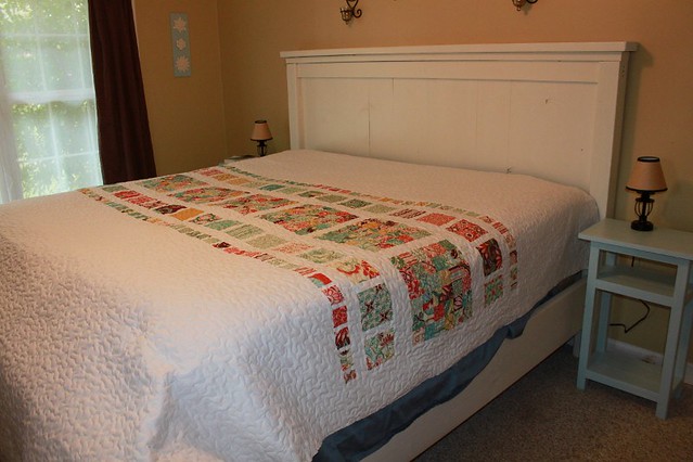
And finally here is my final design and layout of the fabrics within it:

What do you think of the design and layout that I chose? I'm really happy with it, I love it! In the next post I'll talk about the piecing and quilting of the quilt.
It looks lovely! I think it was the right decision to swap out the darker green pieces. The green and lilac work really well together and I love the layout.
ReplyDelete